Schneider Electric

EcoStruxure Energy Hub

UX/UI design · Enterprise SaaS · Design Team Leadership
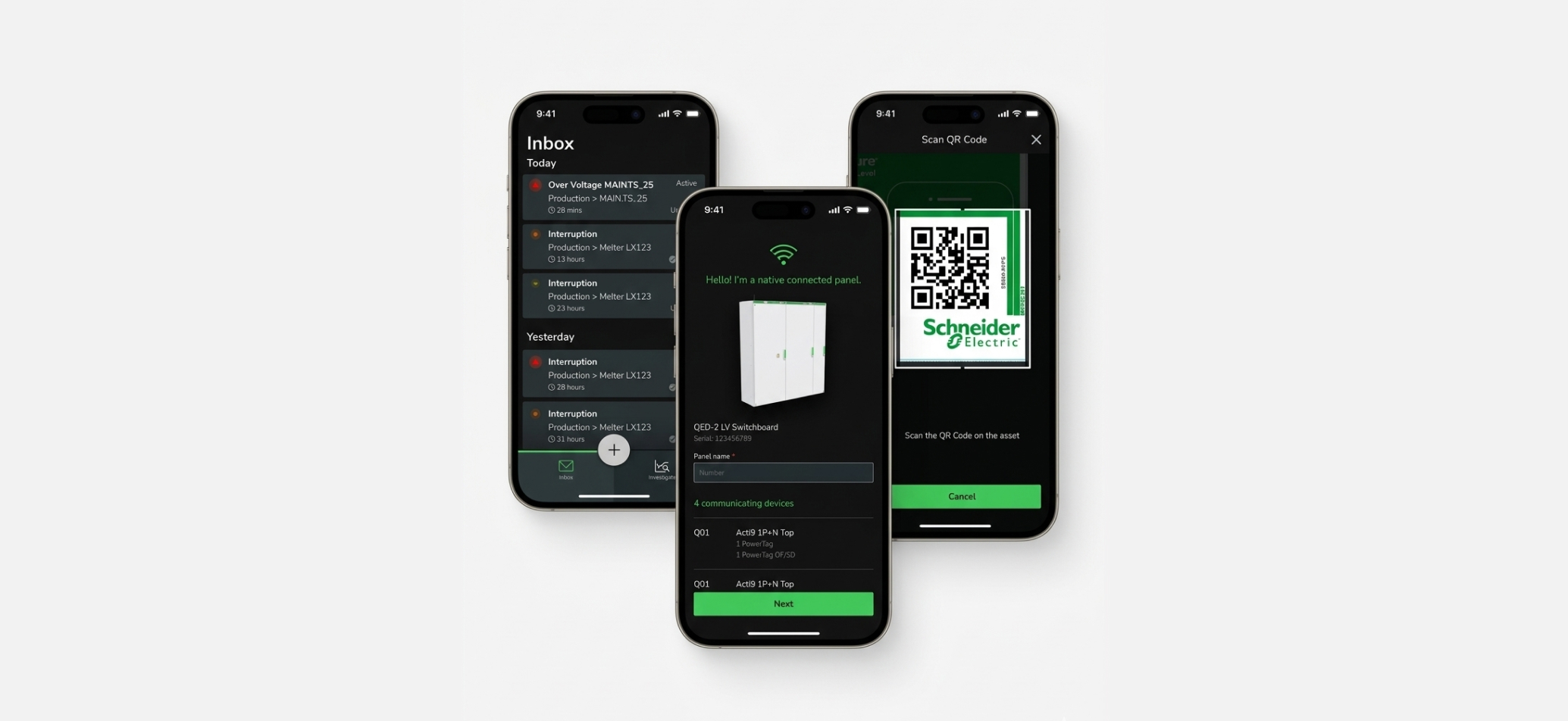
Three phone screens from the EcoStruxure Energy Hub mobile app: Inbox, native connected panel detection, and QR code scan
Role
Senior UX Designer · Mobile Workflow Lead · UX Team Co-Lead
Timeline
Sept 2020–Sept 2022
Location
Global Cross-Functional Team

01 / Executive Summary

I led the mobile deployment workflow for EcoStruxure Energy Hub — an industrial building energy management platform — partnering across UX, product, and engineering to make getting a site online faster and less dependent on manual work.

Business Impact
Achieved up to 25% faster startup and same-day onboarding, compared with traditional on-premise building and energy-management systems (published via official Schneider Electric press release).
Leadership Value
Looked beyond individual screen layouts to challenge legacy technical constraints, bridge siloed engineering groups, and co-lead a 9-designer team to introduce lean Agile rituals that streamlined collaboration across 8 global development teams.

02 / Challenge

Systems Level Friction

Traditional deployment could take multiple days, was manual, physically distributed, and heavily dependent on specialized, high-cost labor. Technicians moved between equipment, manually recorded identifiers, and risked missing critical information.

The Mandate: Reduce the cost of deployment by delivering an out-of-the-box deployment experience for customers.

03 / Process

Uncovering Insights from Manual Deployment

Being new to the industry, I started speaking to experienced technicians, industry experts, product owners, and an offer manager to understand what happened during commissioning.

Technicians moved between equipment, recorded identifiers manually, took photos so information could be entered later, and sometimes had to retrace their steps when information was missing.

04 / Design the Solution

Unlocking Hidden Hardware Capabilities

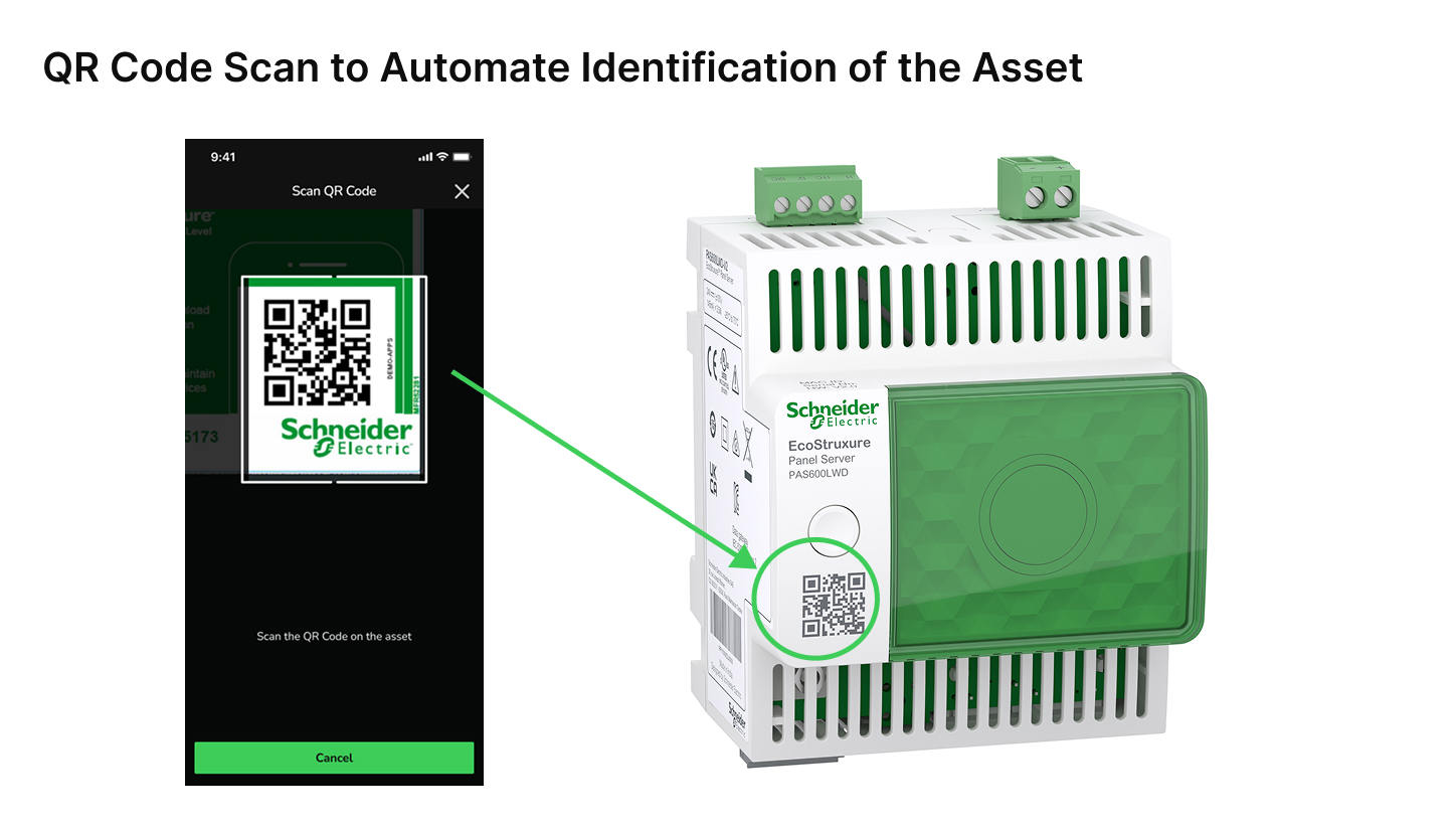
While equipment labels already featured QR codes, they weren’t being used for deployment. The offer manager and the design team saw an opportunity to use them to automatically identify the equipment instead of asking technicians to manually capture and enter IDs.

Development initially believed the QR code could not support the workflow.
Challenging Constraints
Rather than accepting the technical blocker, I visually demonstrated an ideal-state user workflow diagram against the friction of manual logging and pushed the team to investigate.
Breaking Down Corporate Silos
The product owner found the team that owned the QR system, and the two development groups worked together to make the required identifiers available.
Designing the Primary Path with Fallback
Designed a “Scan-and-Connect” automated primary path while providing manual input as a fallback.
QR Code Scan to Automate Identification of the Asset: the mobile app's scan screen next to the physical QR code on the EcoStruxure Panel Server hardware
Add-asset flow, recorded from the mobile app

Cohesive Journey: Mobile to Web Handoff

I partnered closely with the web app designer so the mobile and desktop workflows worked as one journey:

Mobile (Field Work)
Identify Equipment ➔ Connect Panel ➔ Confirm Devices
Web (Desktop Configuration)
Create Organization ➔ Configure Site ➔ Place Devices in Context
Usability Synthesis
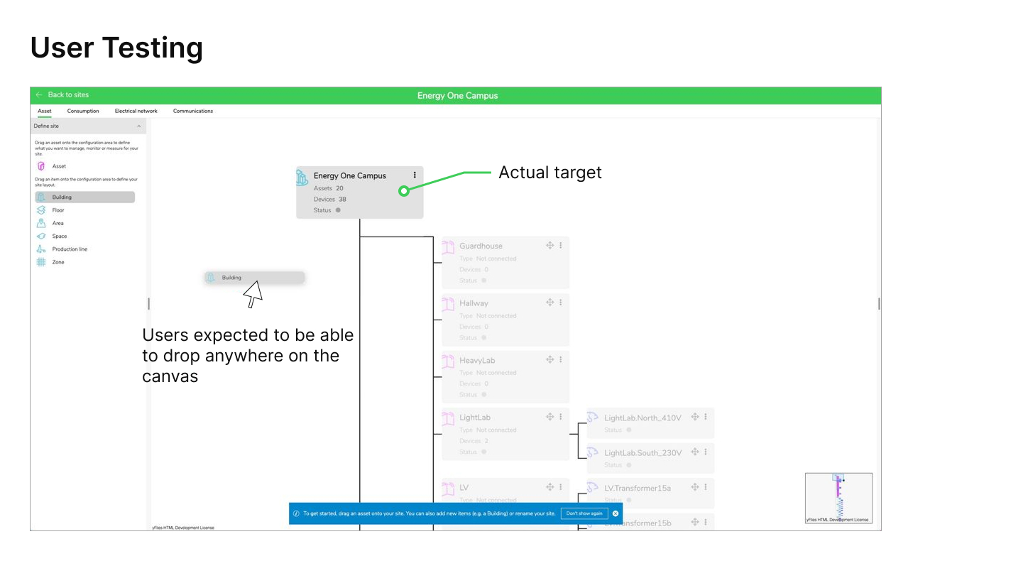
Team usability testing also uncovered a mismatch in the hierarchy builder: users expected to drop items onto the canvas, while the interface required them to drop directly onto existing nodes. I participated in research synthesis and design feedback.

Quick fix: Add clear text instructions for valid drop target.

Longer-term direction: support the user’s mental model.
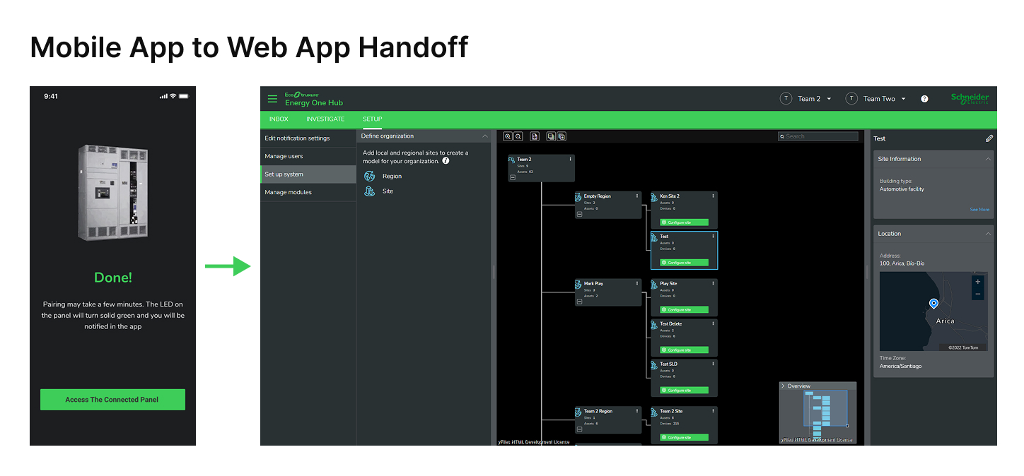
Mobile App to Web App Handoff: a paired panel finishes pairing on mobile, then arrow to the web app's site hierarchy configuration screen
User testing finding: users expected to drop an asset anywhere on the canvas, annotated against the actual required drop target

05 / Leadership

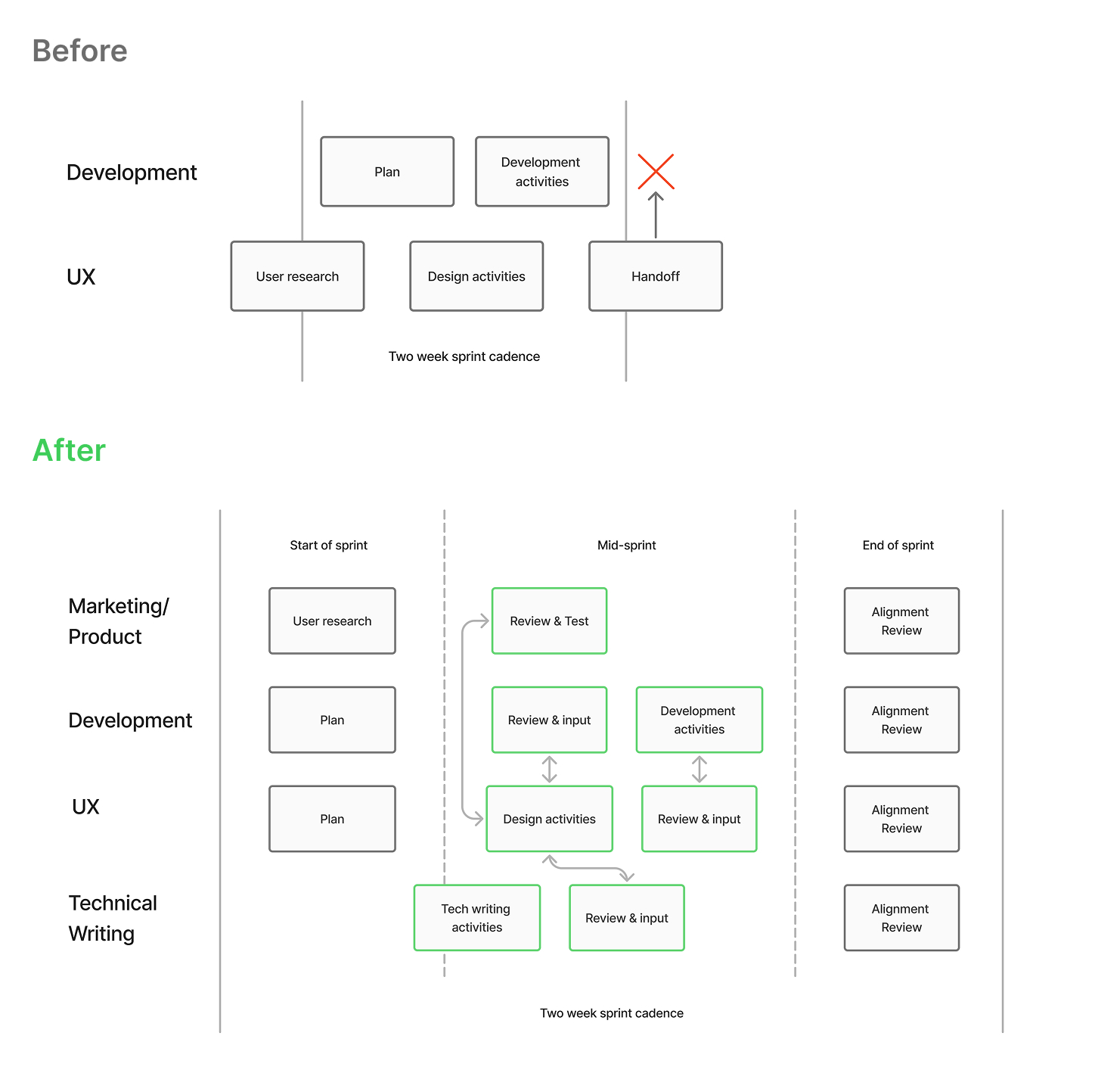
UX Design Operations: Redesigning the Team Rhythm

With 9 UX designers supporting 8 global development teams across multiple feature areas, mismatched design and engineering sprints created unclear deadlines, handoff surprises, and design deliverables arriving at the wrong time for implementation.

During my 9-month assignment to co-lead the UX team, I co-designed and introduced a new operating model to align with 2-week Agile development cycles:
Linked Workflows
Connected Azure DevOps directly to Figma file architectures for continuous engineering visibility.
Predictable Execution
Established structural UX design sprints, standardized retrospectives, closer participation in development rituals, established design and development team syncs, and clear ownership & delivery requirements.
The Outcome
Clearer deadlines, fewer handoff surprises, better design to development alignment, more predictable delivery, and better working relationships across teams.
Before and after team operating model diagram: before, UX and Development sprints run in parallel with a broken handoff; after, Marketing/Product, Development, UX, and Technical Writing align on a shared two-week sprint cadence with review and alignment checkpoints

06 / Outcome

The Value Delivered

For Business
Enabled competitive deployment price offering that generated new customer acquisition and long-term recurring app & service subscription revenue of 1.16M EUR in FY2024.
For Technicians
Less manual identification and a more automated path through the mobile app, with the option to hand off web app deployment to the customer — freeing up valuable technician resources.
For Customers
Lowered the initial barrier to entry by delivering up to 25% faster startup and same-day onboarding.
For the Product Team
Established a scalable UX operational model that eliminated cross-team friction across the teams.
25%
Faster startup vs. traditional on-premise systems
1.16M €
Recurring app & service revenue, FY2024
8
Global development teams aligned to one rhythm

Reducing Complexity at More Than One Level

We started by asking:

Why was this information being entered manually?

Who really needed to perform each deployment step?

Why were our own teams making delivery harder than it needed to be?

Take away: The strongest improvements came from looking beyond the individual screen and redesigning the workflow around it.